I know I’ve taken a break from blogging, and I think we can just go ahead and blame that on 2020 like everything else! Although the blog has been behind, there has been a TON going on photography wise – despite the craziness of COVID-19. I had to pause weddings, family sessions, maternity sessions, and newborn shoots, which was definitely disappointing. However, in the meantime I have been collaborating with some amazing fashion designers and shops, and have really enjoyed growing the branding side of the business!
One of the shops I’m SO excited about is Johnny Banana Co! This clothing brand is homegrown right here in the US, based in Chicago. Mom run and operated, they focus on kids clothes that stand out, but are extremely soft, comfortable, and high quality! They definitely caught my eye when looking for unique and quality items for my kiddos, and one of the MANY things I love about them are the awesome, vibrant colors! If you love any of the outfits in this post as much as I do, feel free to use the code MILLERNANA at checkout to save money on your order!
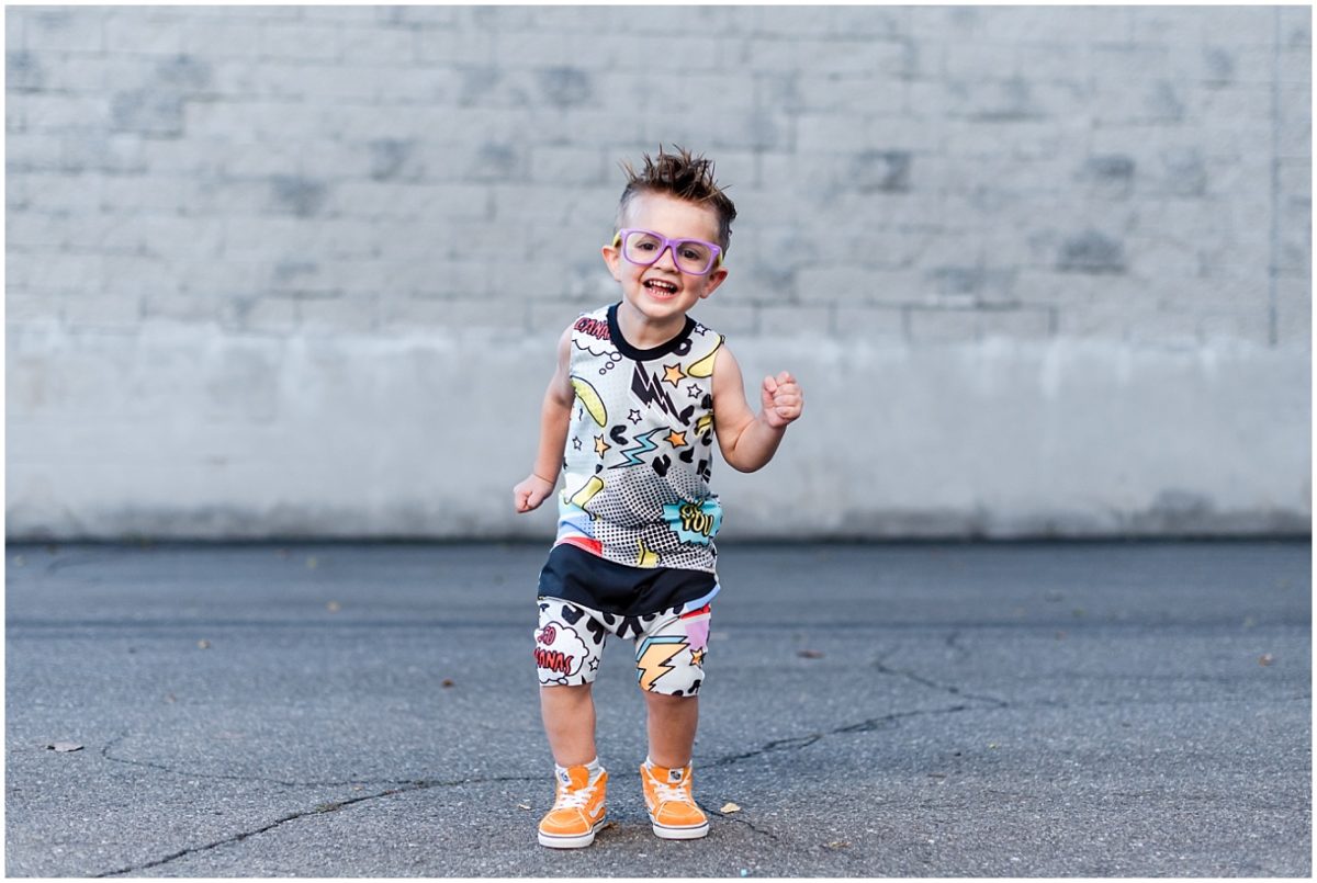
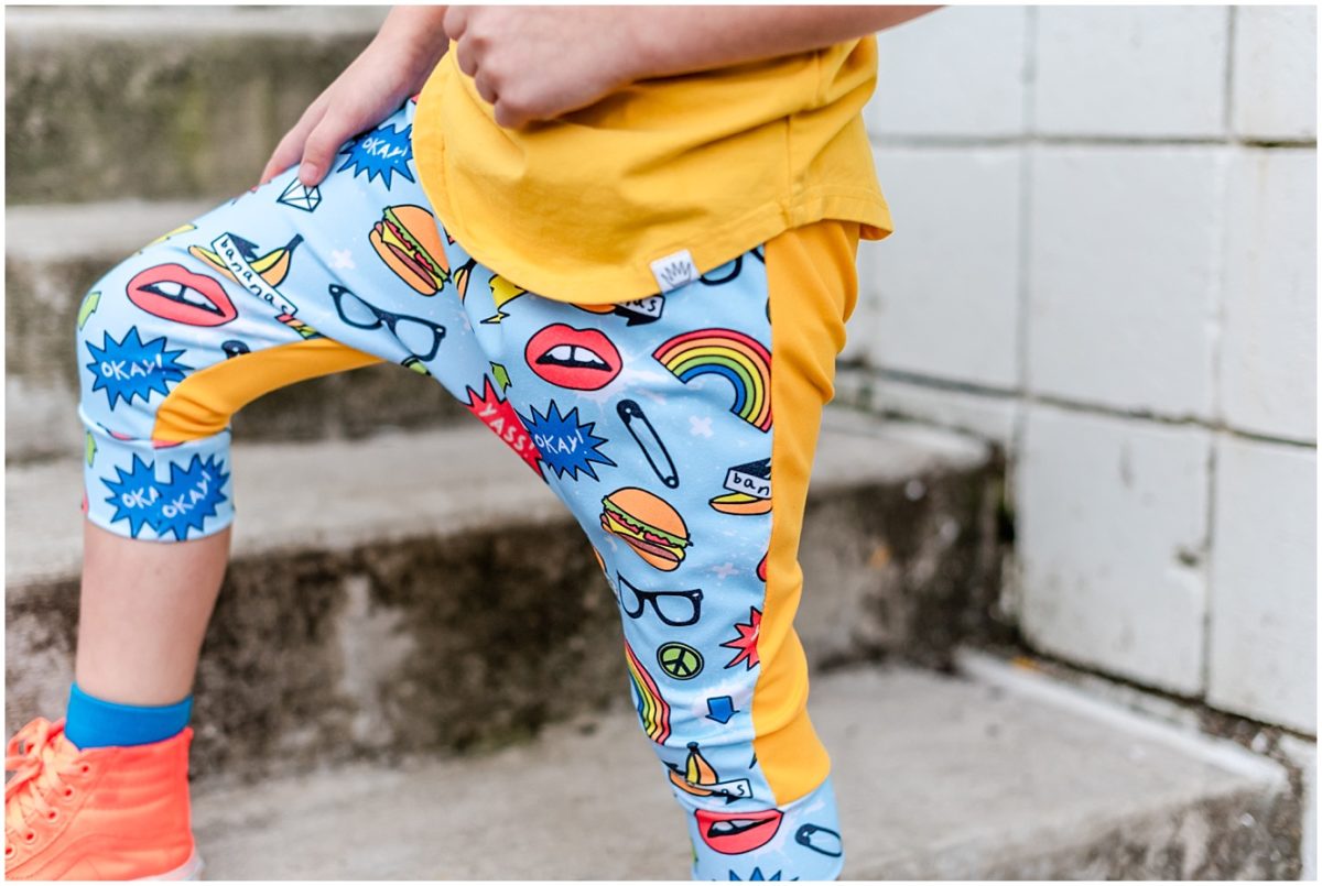
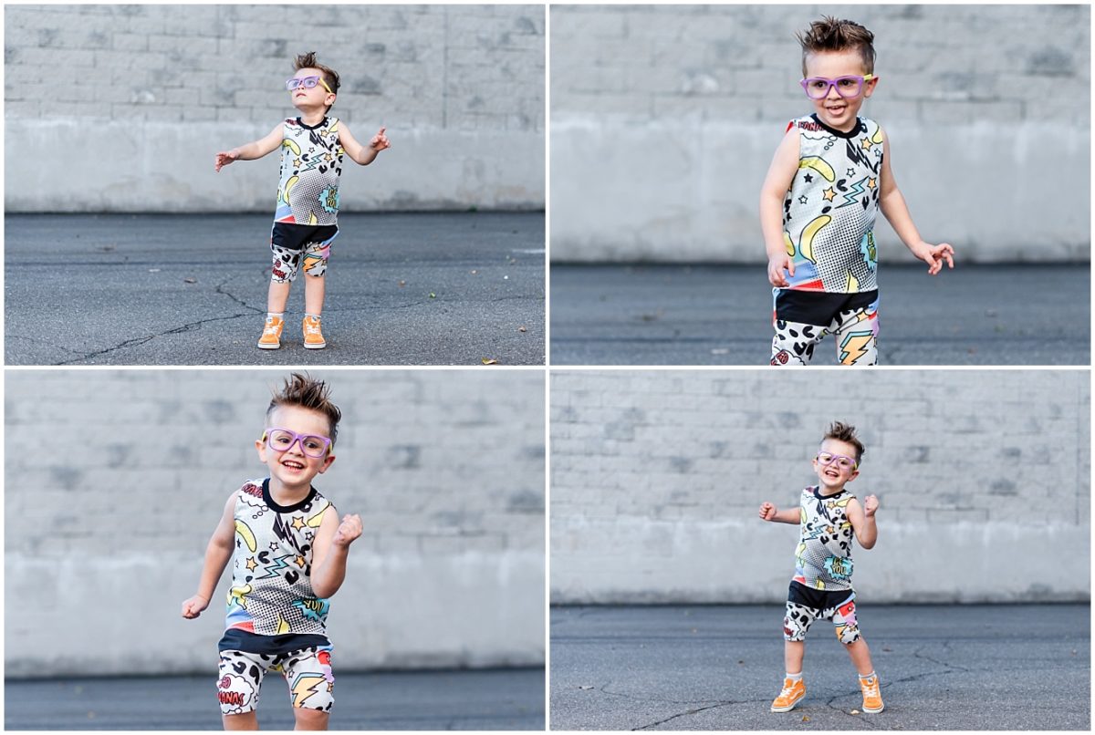
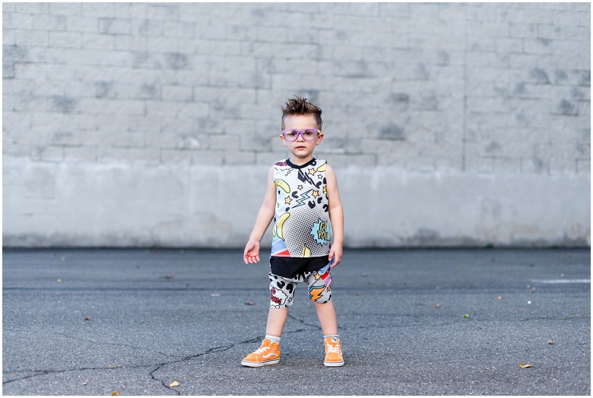
Shop the look: Pop Art Shorts and matching Pop Art Tank by Johnny Banana Co.
One of the challenges that I have run into as a photographer is taking photos of subjects wearing vivid or bright colors. I offer a lengthy style guide for clients who are looking to coordinate outfits for family or engagement photos, and here’s a free tip directly from the guide – neutrals and soft colors photograph best. Well, here I am, going to tell you otherwise!
Okay, not completely otherwise 🙂 – for family photos that you will hang on your wall, I stand by the style guide. It’s hard to coordinate and decorate your house with family photos when everyone is wear hot pink and lime green. That being said – KIDS photos are all about FUN! And one of the things I love most for my kids, are fun colors. So here are some challenges that come with photographing bright and vibrant colors, and tips on how to combat them!
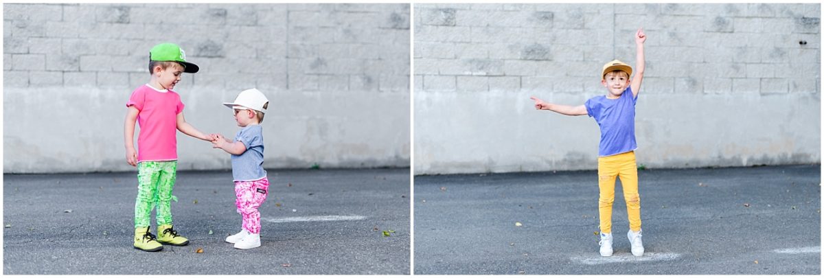
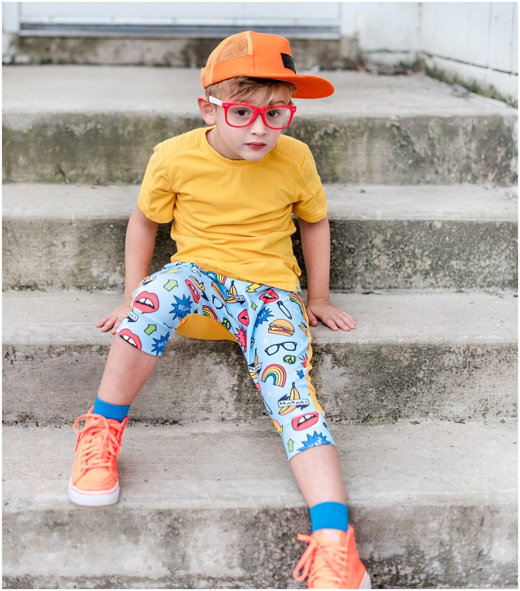
Shop the look: Blue Emoji Shorts by Johnny Banana Co.
Challenge One: Coordinating multiple kids
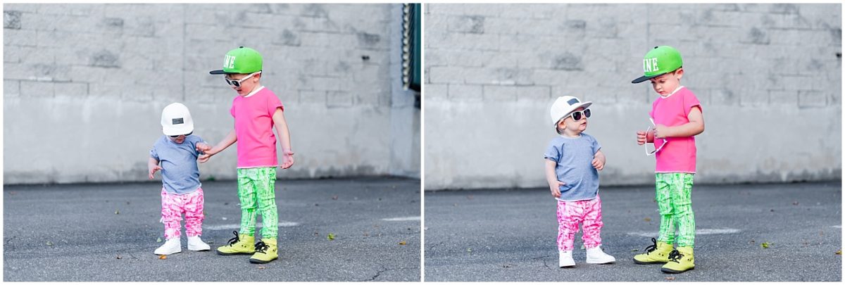
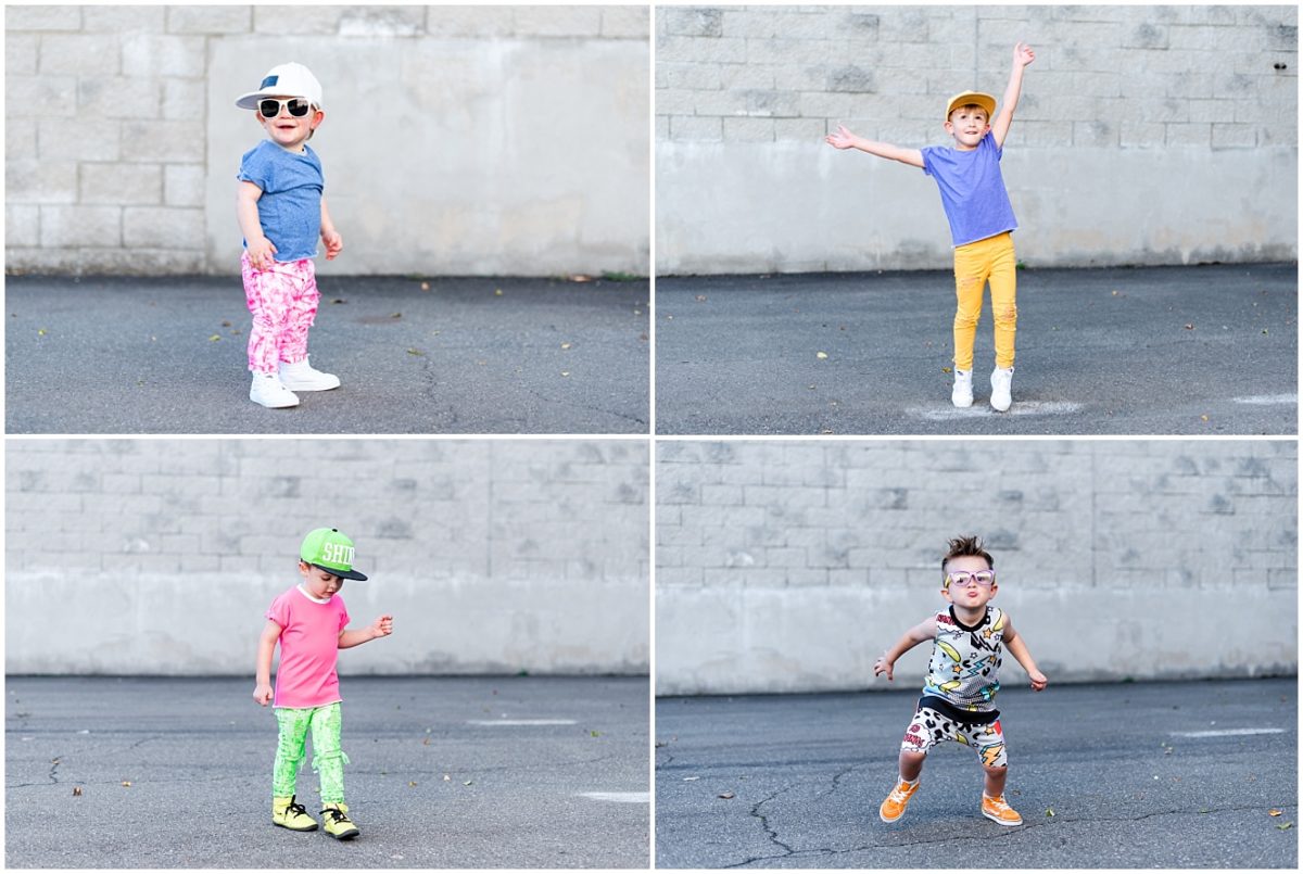
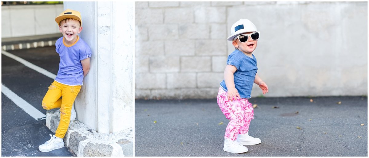
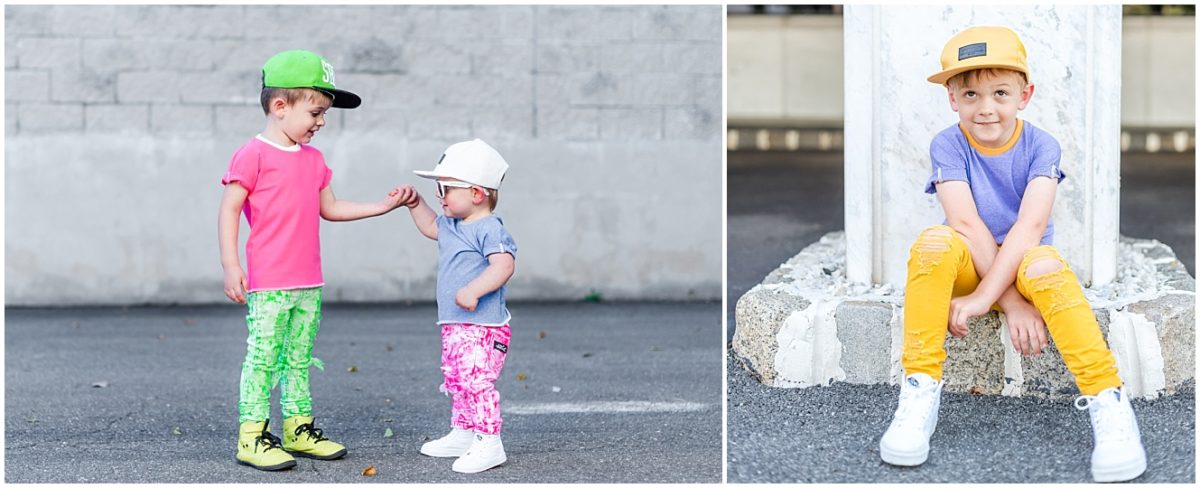
When you want multiple kids in a photo, and there are a bunch of bright colors, it can easily get overwhelmed. One suggestion is to NOT go 100% matching, and instead try picking one color to coordinate them, while still allowing their individual outfits to shine. Take Charlie and Matty for instance:

Or better yet – put it sideways or backwards! Andy may look like he disagrees, but he secretly likes his sideways hat 😛

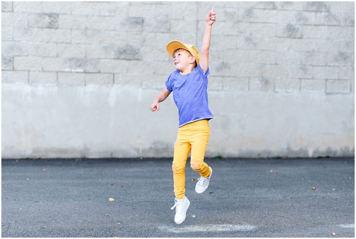
Shop the look: Lavender Roll Tee by Johnny Banana Co.
Challenge Four: Editing
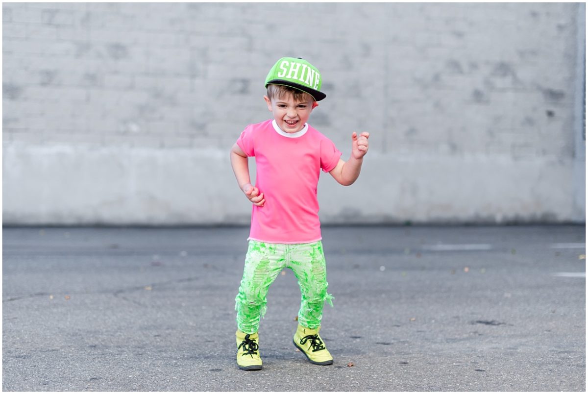
Editing can be tricky when you are working with bright colors. I try to keep photos true to life, and sometimes raising the shadows can result in some funky colors. While it does help to have a nice neutral location to shoot in, the HSL section in Lightroom becomes my BFF when editing pics. It enables me to tone down or raise specific shades of colors to ensure they are featured properly. The goal is not to increase saturation or make them look different than how they appear in real life – it’s simply to showcase them properly!
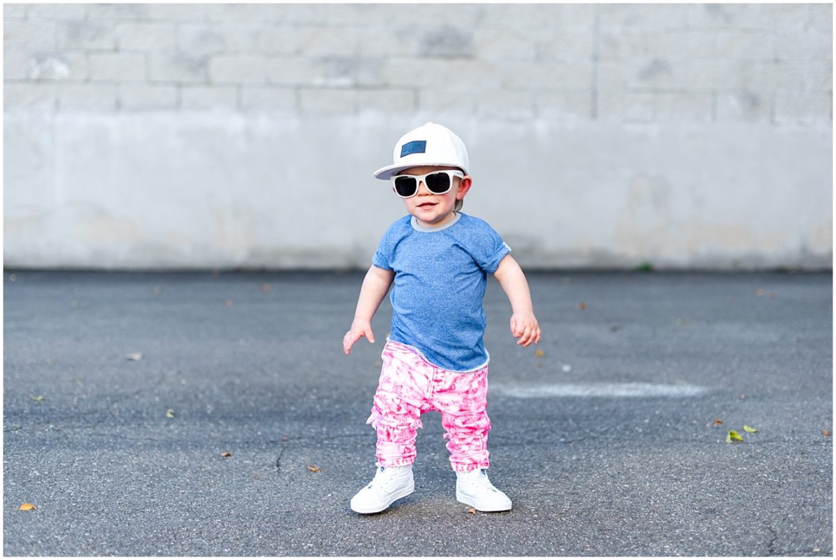
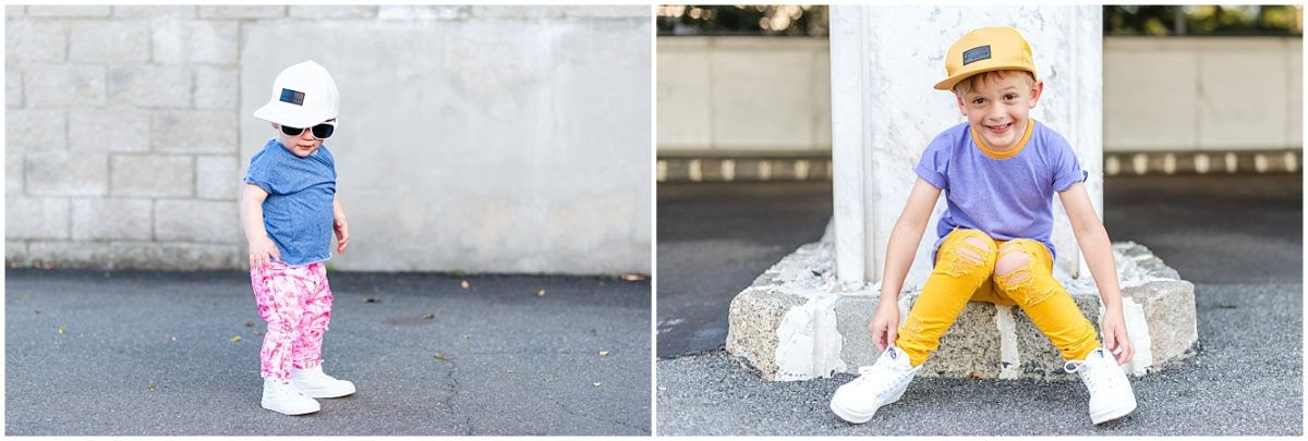
Shop the look: Cloud Blue Roll Tee by Johnny Banana Co.
I hope you found these tips helpful! Thanks so much to Johnny Banana Co. for sponsoring this blog post – Go Bananas, Be You!


comments